
Several months ago, I read Brent Dyke’s Forbes article about data storytelling, and the big takeaway for me was this: People don’t remember numbers. What they do remember are stories. As someone who has spent over a decade working with data, this piece reminded me about the importance of helping stakeholders connect with data so that they can understand, remember and use it. Connecting to the data themselves happens via the logical, left side of the brain. To reach a broader audience, the emotional, right side of the brain needs to engage. That’s where the story comes in. If we can’t get stakeholders to feel something about the numbers we share, our impact will be minimal.
In implementation science, there is an emphasis on data use for decision-making. So much of good implementation practice is making iterative improvements to a program or strategy. To make these, we need good data. But beyond that, we need to tell a story with the data. The story not only gives us context for the data, but some framing for how we might go about making improvements. And since we’re sharing data with a broad group of stakeholders, we need everyone, from the implementation team to the practitioner to the family receiving services, to be able to make sense of it.
Dykes framed data storytelling as a combination of three key components: the data, the visuals, and the narrative. If the data are to tell a story that is memorable, then the visuals and the narrative need to work together with the data to tell that story. The element that most often seems out of sync in my experience are the visuals. I’ve seen many an impenetrable graph in my time. These types of visualizations ultimately confuse readers rather than provide clarity.
Hopefully you’re nodding your head. The trick is, of course, how to tell a story, and by extension, how to make data meaningful and accessible. For me, data visualization is the bridge between the complex and impenetrable and the accessible and meaningful. Stephanie Evergreen and Ann Emery are two of my heroes in the world of data visualization. They have published best practice guidelines that are straightforward and 100% doable. I know, because I too, was once guilty of creating pie charts with 18 slices, and with their guidance, managed to reform.
Step 1: Talk to your stakeholders before you do any technical work. If you’re packaging data to share with someone else, you need to find out what they’re interested in and what’s keeping them up at night. Remember, you want folks to use these data to inform their implementation! If you don’t have a good sense of what their practice is and what their strengths and challenges are, you might find yourself barking up the wrong the tree. And by engaging stakeholders on the front end, you’re building buy-in, which is helpful under any circumstances, but even more so when the data tell us something we may not want to hear.
Step 2: Keep it simple. As for the technical, my guidance is this: Less is more. Think about what your stakeholders need from you, and the story the data are telling. What do your partners want to know more about? What do you want your readers to take away from the data? If the data are to be actionable, we want folks to see the story and then think about what the next chapter might be. So, keep it simple and minimize any noise.
And forget everything you learned about presenting data for academic audiences. Use descriptive titles and highlight the main points. Use color to emphasize key takeaways and draw the reader’s eye. I highly recommend taking a recent graph or table you’ve made and then walking through Ann and Stephanie’s data viz checklist and see if you can clean things up a bit. It may be somewhat humbling but think of it as using data to drive improvement.
To give you a sense of what a data viz makeover might look like, I’ll share one of mine. Several years ago, I was doing evaluation work for a series of grantees across North Carolina. The annual data reports I was giving them were far from helpful. Grantees couldn’t understand how their programs were going or make decisions about how to improve.
After talking with the sites to get a better sense of how I could help them get what they needed from the data, I decided it was time for a reboot. The graph on the left is your classic Excel bar chart, which I was using to share pre- and post-test outcomes for a group of adolescents. What my grantees were ultimately interested in here was the difference: how did teens do at post-test compared with how they did at pre-test? But instead of focusing on that, I was essentially giving them two inches of bar chart that they had no interest in.
I decided to rework this chart into a series of dumbbell plots that show the pre-test score in the open circle, and the post-test score in the closed circle. The dumbbell plots are all oriented on the same axis, so my grantees could easily see where they made the biggest gains over time.
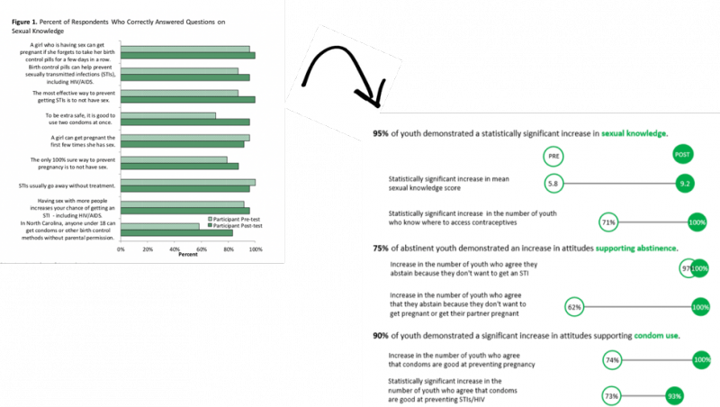
The result was a success! My grantees got a story instead of a mess. And the story clearly showed them where they had the biggest successes and room for growth. Or, to look at it another way, what they should replicate and where they might need to improve their practice. I don’t know that I’d say the finished product is perfect, but I’m reminded of this quote by Antoine de St. Exupéry: “Perfection is achieved, not when there is nothing more to add, but when there is nothing left to take away.”